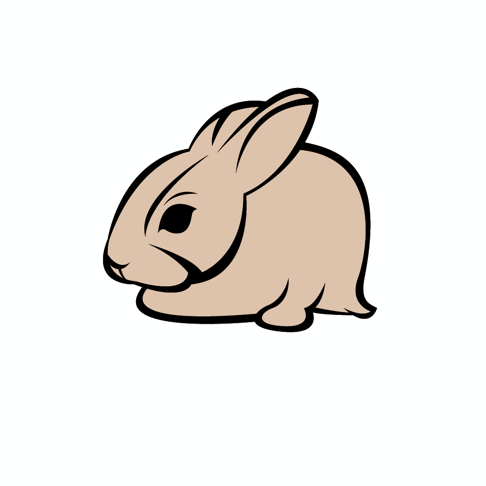
Since I have stopped studying, I just really haven´t been studying for real, until last week, when friend of mine told me for this Fraiser Davidson workflow and techniqes tutorial on skillshare. I was so impressed by the workflow and result, I just had to published it. So i made a little rabbit bunny sports logo :)
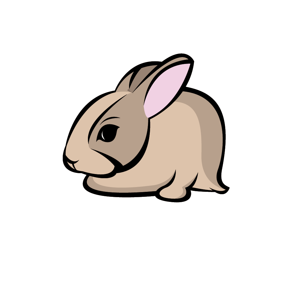
First things first, Had to outline my relate pic. It was a pic of a random bunny from Google. So i just outline the basic shapes of lets say object.
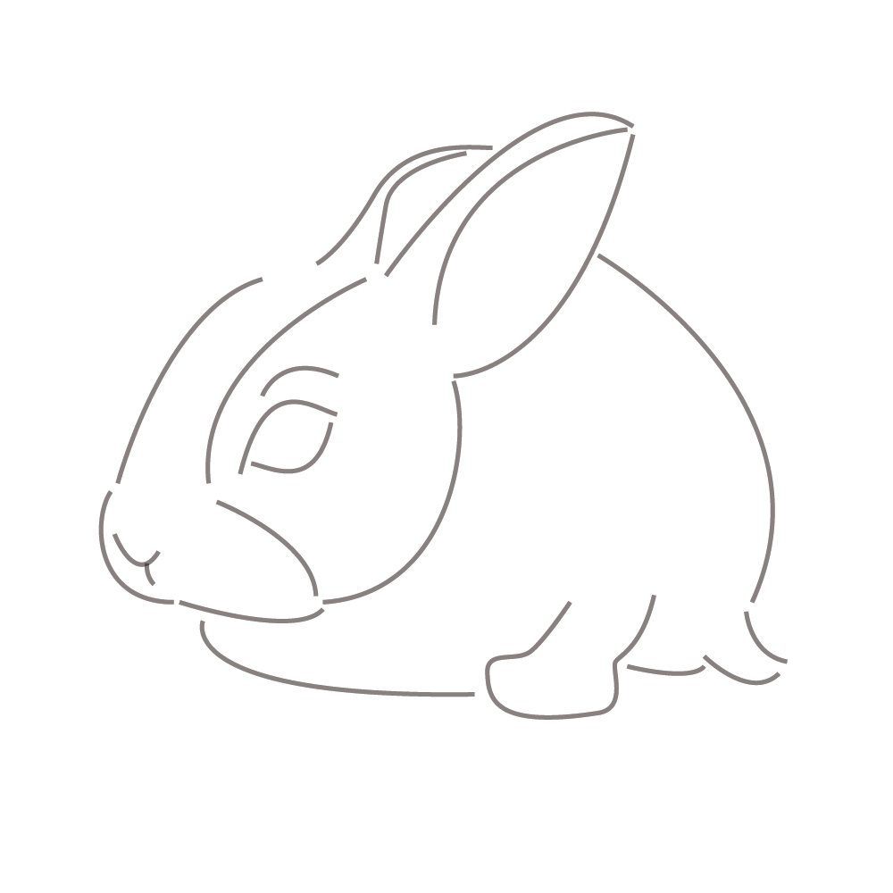
2. step: added a bit more depth and thickness to the lines.
3. I hide outline, and fix a few things of thick lines, to get more fluent lines. What i learned here. You never use more than two point (vertices) curve in Illustrator. This gives you really good power of thickness and nice shapes. So if you dont know what to do, try to practice that.
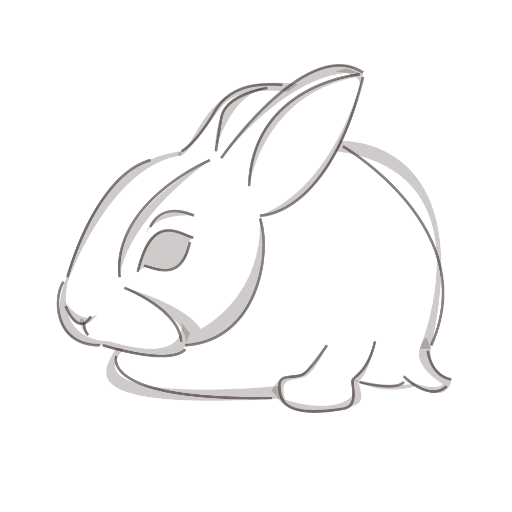
4. Started coloring project. I added background in earthly tones.
5. Added shading to object. I just added where i think the shading should be. Could do a better job here but, since was just a training, skills polishing and not a project for someone else this will do the trick.
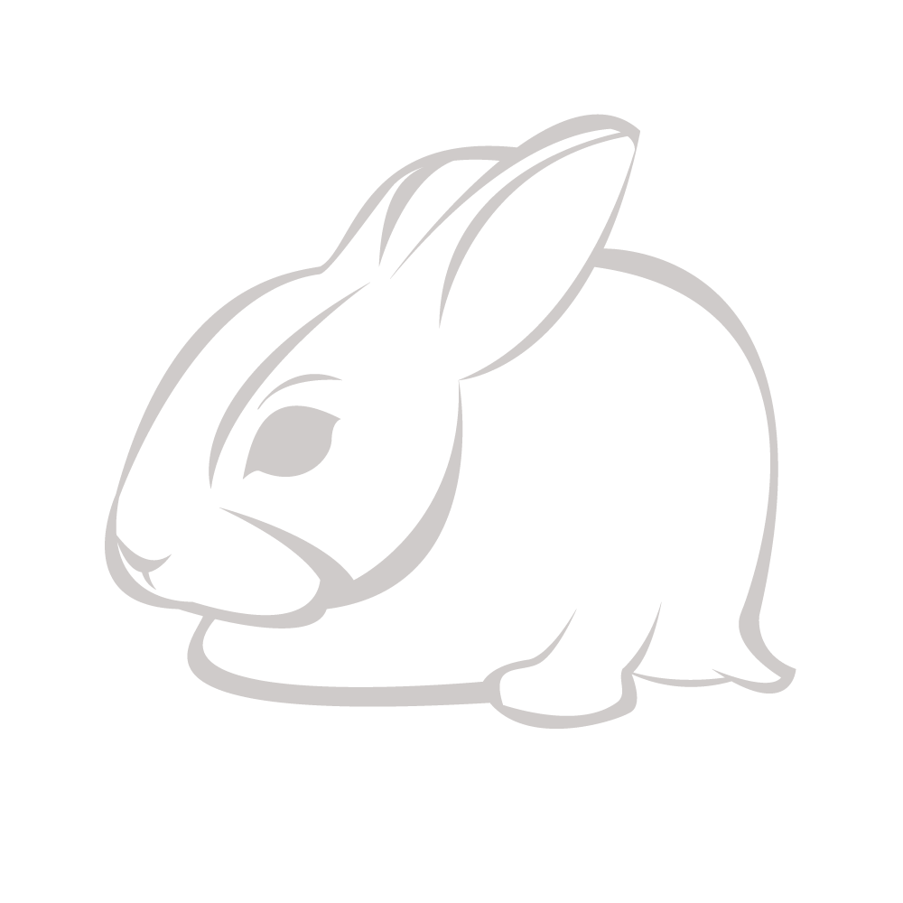
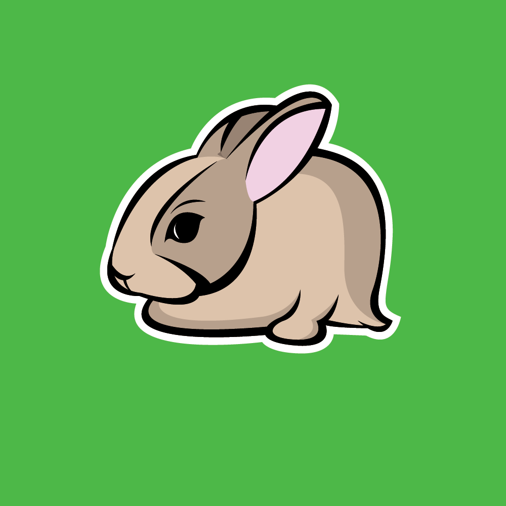
6. Final step of the way. Added background in green, I think it pulls the rabbit out, and the sports logo thick white outline, afterall it was a sports logo tutorial.
Please appeciate and try to learn something new every day.